To Figure out the content layout on mobile devices is a little tricky task. You get all the space in desktop devices where you can easily work your space up, but the size of the screen is limited on mobile devices. A very small amount of space content will be visible before then can scroll.
It might make you wonder thinking what will be the most efficient layout for viewing content on mobile is. Should you use a list view or grid view? It will decide how quick and easy it is for the users to navigate and to find what exactly they are looking for.
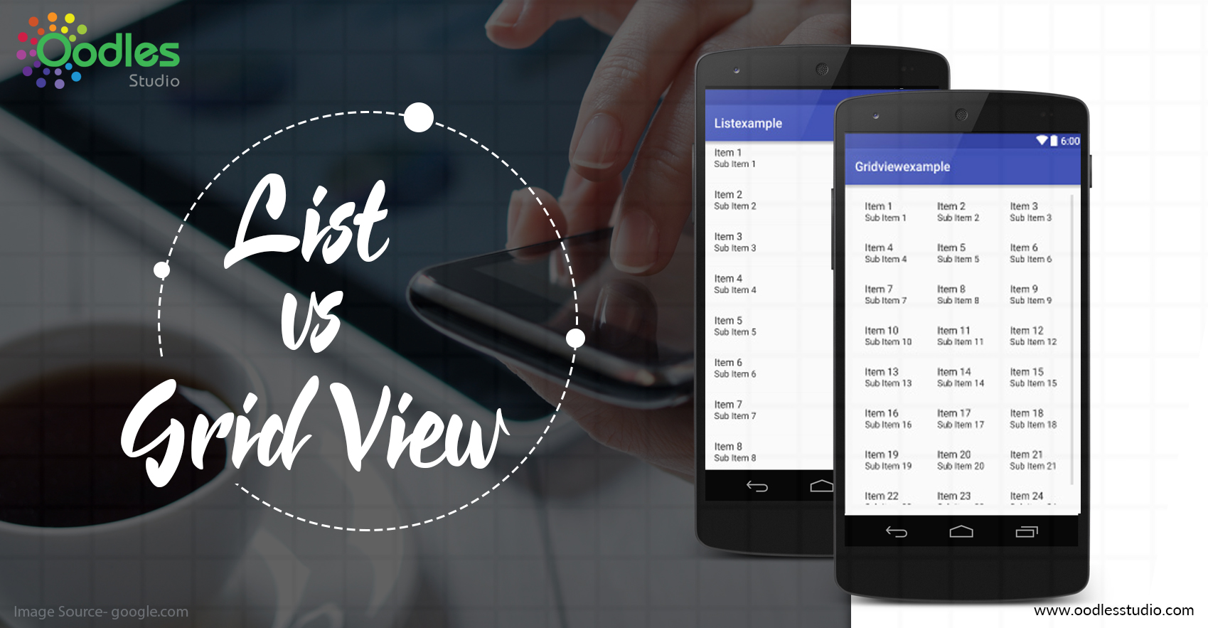
List view exhibits your content in a single column list. Its text is heavy and there are no images. You can exhibit icons or thumbnails near to the text. Users rely on what they read to make their decision.
Grid view displays the page’s content in two/more columns with their respective images. The images always mainstream most of the space, and text is made short to prevent much text wrapping. Users rely on the images to make their selection.
List View Prevents Overscrolling
Designers use grid view because it looks simpler to the eye, But the only problem with this method is that user has to scroll to view more. Gridview includes images which make the page longer. To view all other options, users have to scroll the whole page.
Listview always prevents over scrolling which makes the user view all the content there. The exclusion of images allows you to fit more options per screen.
List View Prevents Hasty Selections
Grid view forces users to scroll more, Users get attracted by the images and select the very first option that attracts them.
This leads them to the part of the section that doesn’t have what they’re looking for. Then the user has to go back and scroll more. With many images, it will be confusing for the user and might get distracted.
List view prevents users from making difficult selections. The text provides enough information to help them find the content they want.
Grid View Works Best for Examining Details
Grid view also helps users when they’re examining details. For example, if a user is shopping for a shirt, they’ll have a specific type in mind.
A grid view which displays the clothes will distract more than it could help because the use user has to scroll to filter out a lot of irrelevant images when they scan for their choice.
Final Thoughts
Most of the users scroll fast or want the information quickly when they’re on a mobile site. They want to find the content fast and to make it happen we need to choose the best layout.
On Desktop, there are more flexible layouts, but on mobile, your choice is important. The viewpoint which allows users to see more content while doing very less work is the Winner.


